At9 is high-quality
We are at9 coffee
At at9 Coffee, we have carved our place in the industry as
one of the leading coffee providers, committed to providing
the tastiest and fastest coffee experience to our valued
consumers. Founded with a passion for exceptional coffee
and a commitment to delivering high-quality service, we pride
ourselves on being more than just another coffee shop - we are
a community of true coffee lovers.
An experiance
It’s also about providing an unmatched experience for our
customers. From the moment you walk through our doors, we
want you to feel welcomed and relaxed. Our cozy and modern
cafes are designed with comfort in mind, creating an inviting
atmosphere where you can sit back, relax, and enjoy your
favorite coffee,
Our customers
We understand that time is precious for our customers which is
why we have streamlined our processes to provide lightning-fast
service without compromising on quality. With our efficient
ordering system and state-of-the-art equipment, we guarantee
that you will receive your perfectly brewed cup of at9 coffee in
record time.

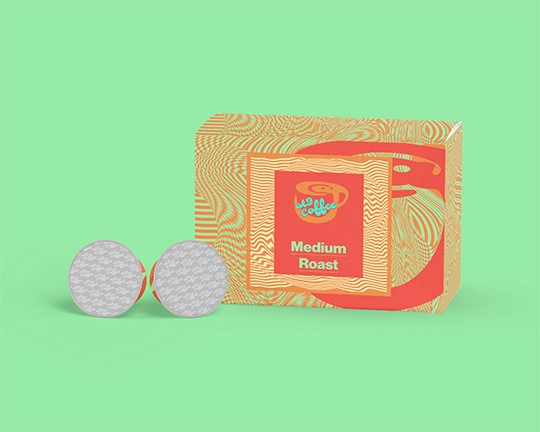


Logo Concepts
It was important to incorporate the company name into a well
thought out and creative logo that expresses the companies theme
and look. So it was important to have the “@” symbol, the number
nine and a visual aspect that refrenced coffee, During the process
it became clear that the number nine could be used to create a
shape that resembles a coffee mug which then lead to the final
logo. The logo also needed to be a rather organic shape to go
along with the overall feel of the brand.
Final Logo
The final at9 coffee logo checked all of the boxes that were looked
for when creating the logo as it incorporates the “@” symbol, the
number nine and the letter “C” for coffee all while coming together
to illustrate a coffee mught with late art.
The “@” symbol was used to create hole of the cup, while also
representing late art.
The number nine was used to create the body of the logo.
The letter “C”(first letter in the word “coffee”) is reversed and used
to create the handle of the cup.
The overall shape of the logo is rather organic and not too formal
which fits the look and feel of the overall brand and is a brilliant
represnetation of the brands ethos
Logo Type
It was alo important to find a font that would fit well with the
established logo and since Duckie’s “@” symbol was the starting
point of the logo mark there was no better fit than to use the same
font as the logo type.

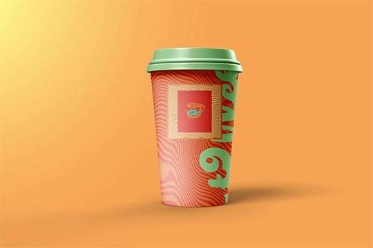


Josef Alexander Kaufmann Graphic Designer and Artist portfolio. I am a highly motivated graphic designer focused in branding, image editing, post-processing, digital retouching, video editing, and logo design.
© MadeofAlex All rights reserved.
madeofalex.info@gmail.com